Styles and Themes
The themed aspect of the modern Tk widgets is one of the most powerful and exciting aspects of the newer widget set. Yet, it's also one of the most confusing.
This chapter explains styles (which control how widgets like buttons look) and themes (which are a collection of styles that define how all the widgets in your application look). Changing themes can give your application an entirely different look.
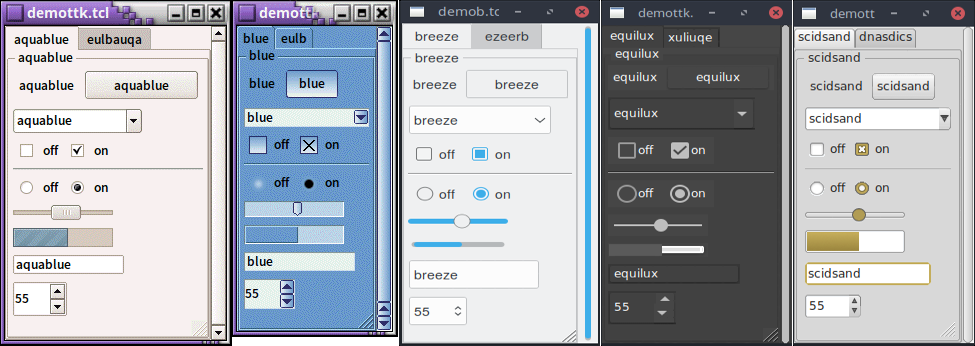
Applying different themes.
Note that it's not just colors that have changed, but the actual shape of individual widgets. Styles and themes are extremely flexible.
Why?
However, before you get carried away, very few applications will benefit from switching themes like this. Some games or educational programs might be exceptions. Using the standard Tk theme for a given platform will display widgets the way people expect to see them, particularly if they're running macOS and Windows.
On Linux systems, there's far less standardization of look and feel. Users expect (and are more comfortable with) some
variability and "coolness." Because different widget sets (typically GTK and QT) are used by window managers, control panels, and other system
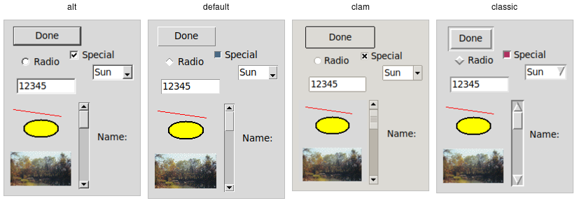
utilities, Tk can't seamlessly blend in with the current settings on any particular system. Most of the Linux screenshots in this
tutorial use Tk's alt theme. Despite users being accustomed to variability, there are limits to what most users will accept.
A prime example is the styling of core widgets in Tk's classic widget set, matching circa-1992 OSF/Motif.
Styles and themes, used in a more targeted manner and with significant restraint, can have a role to play in modern applications. This chapter explains why and when you might want to use them and how to go about doing so. We'll begin by drawing a parallel between Tk's styles and themes and another realm of software development.
Understanding Styles and Themes
If you're familiar with web development, you know about cascading stylesheets (CSS). There are two ways it can be used to customize
the appearance of an element in your HTML page. One way is to add a bunch of style attributes (fonts, colors, borders, etc.) directly
to an element in your HTML code via the style attribute. For example:
<label style="color:red; font-size:14pt; font-weight:bold; background-color:yellow;">Meltdown imminent!</label>The other way to use CSS is to attach a class to each widget via the class attribute.
The details of how elements of that class appear are provided elsewhere, often in a separate CSS file.
You can attach the same class to many elements, and they will all have the same appearance. You don't need to repeat
the full details for every element. More importantly, you separate the logical content of your site (HTML) from its
appearance (CSS).
<label class="danger">Meltdown imminent!</label>
...
<style type="text/css">
label.danger {color:red; font-size:14pt; font-weight:bold; background-color:yellow;}
</style>
Back to Tk.
- In the classic Tk widgets, all appearance customizations require specifying each detail on individual widgets,
akin to always using the
styleHTML attribute. - In the themed Tk widgets, all appearance customizations are made via attaching a style to a widget, akin to using
the
classHTML attribute. Separately, you define how widgets with that style will appear, akin to writing CSS. - Unlike with HTML, you can't freely mix and match. You can't customize some themed entries or buttons with styles and others by directly changing appearance options.
Yes, there are a few exceptions, like labels where you can customize the font and colors through both styles and configuration options.
Benefits
So why use styles and themes in Tk? They take the fine-grained details of appearance decisions away from individual instances of widgets.
That makes for cleaner code and less repetition. If you have 20 entry widgets in your application, you don't need to repeat the exact appearance details every time you create one (or write a wrapper function). Instead, you assign them a style.
Styles also put all appearance decisions in one place. And because styles for a button and styles for other widgets can share common elements, it promotes consistency and improves reuse.
Styles also have many benefits for widget authors. Widgets can delegate most appearance decisions to styles. A widget author no longer has to hardcode logic to the effect of "when the state is disabled, consult the 'disabledforeground' configuration option and use that for the foreground color." Not only did that make coding widgets longer (and more repetitive), but it also restricted how a widget could be changed based on its state. If the widget author omitted logic to change the font when the state changed, you were out of luck as an application developer using the widget.
Using styles, widget authors don't need to provide code for every possible appearance option. That not only simplifies the widget but paradoxically ensures that a wider range of appearances can be set, including those the widget author may not have anticipated.
Using Existing Themes
Before delving into the weightier matters of tastefully and selectively modifying and applying styles to improve the usability of your application and cleanliness of your code, let's deal with the fun bits: using existing themes to completely reskin your application.
Themes are identified by a name. You can obtain the names of all available themes:
>>> s = ttk.Style()
>>> s.theme_names()
('aqua', 'step', 'clam', 'alt', 'default', 'classic')
Tkinter encapsulates all style manipulations in the ttk.Style class. We'll therefore need an instance of that
class for this and other operations.
% ttk::style theme names
aqua clam alt default classic
>> Tk::Tile::Style.theme_names
=> ["aqua", "step", "clam", "alt", "default", "classic"]Perl> Tkx::ttk__style_theme_names()
aqua clam alt default classic
Built-in themes.
Besides the built-in themes (alt, default, clam, and classic), macOS includes a theme named
aqua to match the system-wide style, while Windows includes themes named vista, winxpnative, and
winnative.
Only one theme can be active at a time. To obtain the name of the theme currently in use, use the following:
>>> s.theme_use()
'aqua'
% ttk::style theme use
aqua>> Tk.tk_call('ttk::style', 'theme', 'use')
=> "aqua"As of Ruby/Tk 0.2.0 (current version as of 2020), the Tk::Tile::Style.theme_use API doesn't allow querying the current style.
Perl> Tkx::ttk__style_theme_use()
aqua
This API, which was originally targeted for Tk 8.6, was back-ported to Tk 8.5.9. If you're using an earlier version of Tk getting this info is a bit trickier.
Switching to a new theme can be done with:
s.theme_use('themename')ttk::style theme use themenameTk::Tile::Style.theme_use "themename"Tkx::ttk__style_theme_use("themename");What does this actually do? Obviously, it sets the current theme to the indicated theme. Doing this, therefore, replaces all the currently available styles with the set of styles defined by the theme. Finally, it refreshes all widgets, so they take on the appearance described by the new theme.
Third-Party Themes
With a bit of looking around, you can find some existing add-on themes available for download. A good starting point is https://wiki.tcl-lang.org/page/List+of+ttk+Themes.
Though themes can be defined in any language that Tk supports, most that you will find are written in Tcl. How can you install them so that they are available to use in your application?
As an example, let's use the "awdark" theme, available from https://sourceforge.net/projects/tcl-awthemes/.
Download and unzip the awthemes-*.zip file somewhere. You'll notice it contains a bunch of .tcl files, a
subdirectory i containing more directory with images used by the theme, etc.
One of the files is named pkgIndex.tcl.
This identifies it as a Tcl package, which is similar to a module in other languages.
If we look inside, you'll see a bunch of lines like package ifneeded awdark 7.7. Here, awdark is the name
of the package, and 7.7 is its version number. It's not unusual, as in this case, for a single pkgIndex.tcl file
to provide several packages.
To use it, we need to tell Tcl where to find the package (via adding its directory to Tcl's auto_path) and the name of the
package to use.
root.tk.call('lappend', 'auto_path', '/full/path/to/awthemes-9.3.1')
root.tk.call('package', 'require', 'awdark')
lappend auto_path "/full/path/to/awthemes-9.3.1"
package require awdarkTk.tk_call('lappend', 'auto_path', '/full/path/to/awthemes-9.3.1')
Tk.tk_call('package', 'require', 'awdark')Tkx::eval("lappend auto_path \"/full/path/to/awthemes-9.3.1\"");
Tkx::eval("package require awdark");If the theme is instead implemented as a single Tcl source file, without a pkgIndex.tcl, you can make it available like this:
root.tk.call('source', '/full/path/to/themefile.tcl')source "/full/path/to/themefile.tcl"Tk.tk_call('source', '/full/path/to/themefile.tcl')Tkx::eval("source \"/full/path/to/themefile.tcl\"");You should now be able to use the theme in your own application, just as you would a built-in theme.
Using Styles
We'll now tackle the more complex issue of taking full advantage of styles and themes within your application, not just reskinning it with an existing theme.
Definitions
We first need to introduce a few essential concepts.
Widget Class
A widget class identifies the type of a particular widget, whether
it is a button, a label, a canvas, etc. All themed widgets have a default class. Buttons have the class TButton,
labels TLabel, etc.
Widget State
A widget state allows a single widget to have more than one appearance or behavior, depending on things like mouse position, different state options set by the application, and so on.
As you'll recall, all themed widgets maintain a set of binary state flags, accessed by the state and instate methods.
The flags are: active, disabled, focus, pressed,
selected, background, readonly, alternate, and invalid.
All widgets have the same set of state flags, though they may ignore some of them (e.g., a label widget would
likely ignore an invalid state flag). See the themed widget page
in the reference manual for the exact meaning of each state flag.
Style
A style describes the appearance (or appearances) of a widget class. All themed widgets having the same widget class will have the same appearance(s).
Styles are referred to by the name of the widget class they describe. For example,
the style TButton defines the appearance of all widgets with the class TButton.
Styles know about different states, and one style can define different appearances based on a widget's state.
For example, a style can specify how a widget's appearance should change if the pressed state flag is set.
Theme
A theme is a collection of styles. While each style is widget-specific (one for buttons, one for entries, etc.), a theme collects many styles together. All styles in the same theme will be designed to visually "fit" together with each other. (Tk doesn't technically restrict bad design or judgment, unfortunately!)
Using a particular theme in an application really means that, by default, the appearance of each widget will be controlled by the style within that theme responsible for that widget class.
Style Names
Every style has a name. If you're going to modify a style, create a new one, or use a style for a widget, you need to know its name.
How do you know what the names of the styles are? If you have a particular widget, and you want to know
what style it is currently using, you can first check the value of its style configuration option. If
that is empty, it means the widget is using the default style for the widget. You can retrieve
that via the widget's class. For example:
>>> b = ttk.Button()
>>> b['style']
''
>>> b.winfo_class()
'TButton'
% ttk::button .b
.b
% .b cget -style # empty string as a result
% winfo class .b
TButton>> b = Tk::Tile::Button.new(parent)
=> #<Tk::Tile::TButton:0x10bcca4 @path=".w00001">
>> b['style']
=> []
>> TkWinfo.classname(b)
=> "TButton"Perl> $b = $mw->new_ttk__button()
.b
Perl> $b->cget(-style) # empty string as a result
Perl> Tkx::winfo('class', $b)
TButtonIn this case, the style that is being used is TButton. The default styles for other themed widgets
are named similarly, e.g., TEntry, TLabel, etc.
It's always wise to check the specifics. For example, the treeview widget's class is Treeview, not TTreeview.
Beyond the default styles, though, styles can be named pretty much anything. You might create your own style
(or use a theme that has a style) named FunButton, NuclearReactorButton, or even GuessWhatIAm (not a
wise choice).
More often, you'll find names like Fun.TButton or NuclearReactor.TButton. These suggest
variations of a base style; as you'll see, this is something Tk supports for creating and modifying styles.
The ability to retrieve a list of all currently available styles is currently not supported.
This will likely appear in Tk 8.7 in the form of a new command, ttk::style theme styles,
returning the list of styles implemented by a theme. It also proposes adding a style method
for all widgets, so you don't have to examine both the widget's style configuration option and
its class. See TIP #584.
Applying a Style
To use a style means to apply that style to an individual widget. All you need is the style's name and the widget to apply it to. Setting the style can be done at creation time:
b = ttk.Button(parent, text='Hello', style='Fun.TButton')ttk::button .b -text "Hello" -style "Fun.TButton"b = Tk::Tile::Button.new(parent) {text "Hello"; style "Fun.TButton"}$b = $parent->new_ttk__button(-text => "Hello", -style => "Fun.TButton");A widget's style can also be changed later with the style configuration option:
b['style'] = 'Emergency.TButton'.b configure -style "Emergency.TButton"b['style'] = "Emergency.TButton"$b->configure(-style => "Emergency.TButton");Creating a Simple Style
So how do we create a new style like Emergency.TButton?
In situations like this, you're creating a new style only slightly different from an existing one. This is the most common reason for creating new styles.
For example, you want most of the buttons in your application to keep their usual appearance but have
certain "emergency" buttons highlighted differently. Creating a new style (e.g., Emergency.TButton),
derived from the base style (TButton), is appropriate.
Prepending another name (Emergency) followed by a dot onto an existing style creates a new style
derived from the existing one. The new style will have exactly the same options as the existing one except for the indicated differences:
s.configure('Emergency.TButton', font='helvetica 24', foreground='red', padding=10)ttk::style configure Emergency.TButton -font "helvetica 24" -foreground red -padding 10Tk::Tile::Style.configure('Emergency.TButton', {"font" => "helvetica 24", "foreground" => "red", "padding" => 10})Tkx::ttk__style_configure("Emergency.TButton", -font => "helvetica 24", -foreground => "red", -padding => 10);As shown earlier, you can then apply that style to an individual button widget via its style configuration option.
Every other button widget would retain its normal appearance.
How do you know what options are available to change for a given style? That requires diving a little deeper inside styles.
You may have existing code using the classic widgets that you'd like to move to the themed widgets. Most appearance changes made to classic widgets through configuration options can probably be dropped. For those that can't, you may need to create a new style, as shown above.
State-specific appearance changes can be treated similarly. In classic Tk, several widgets supported a few state changes
via configuration options. For example, setting a button's state option to disabled would draw it
with a greyed-out label. Some allowed an additional state, active, which represented a different
appearance. You could change the widget's appearance in multiple states via a set of
configuration options, e.g., foreground, disabledforeground, and
activeforeground.
State changes via configuration options should be changed to use the state method on themed widgets.
Configuration options to modify the widget's appearance in a particular state should be dealt with in the style.
Classic Tk widgets also supported a very primitive form of styles that you may encounter. This used the option database, a now-obscure front end to X11-style configuration files.
In classic Tk, all buttons had the same class (Button), all labels had the same class (Label), etc.
You could use this widget class both for introspection and for changing options globally through the option database.
It let you say, for example, that all buttons should have a red background.
A few classic Tk widgets, including frame and toplevel widgets, let you change the widget class of a particular widget
when it was first created by providing a class configuration option. For example, you could specify that one specific
frame widget had a class of SpecialFrame, while others would have the default class Frame.
You could use the option database to change the appearance of just the SpecialFrame frames.
Styles and themes take that simple idea and give it rocket boosters.
What's Inside a Style?
If all you want to do is use a style or create a new one with a few tweaks, you now know everything you need. If, however, you want to make more substantial changes, things start to get "interesting."
Elements
While each style controls a single type of widget, each widget is usually composed of smaller pieces, called elements. It's the job of the style author to construct the entire widget out of these smaller elements. What these elements are depends on the widget.
Here's an example of a button. It might have a border on the very outside. That's one element. Just inside that, there may be a focus ring. Normally, it's just the background color, but could be highlighted when a user tabs into the button. So that's a second element. Then there might be some spacing between that focus ring and the button's label. That spacing is a third element. Finally, the text label of the button itself is a fourth element.
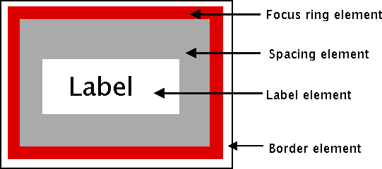
Possible elements of a button.
Why might the style author have divided it up that way? If you have one part of the widget that may be in a different location or a different color than another, it may be a good candidate for an element. Note that this is just one example of how a button could be constructed from elements. Different styles and themes could (and do) accomplish this in different ways.
Here is an example of a vertical scrollbar. It consists of a "trough" element, which contains other elements. These include the up and down arrow elements at either end and a "thumb" element in the middle (it might have additional elements, like borders).
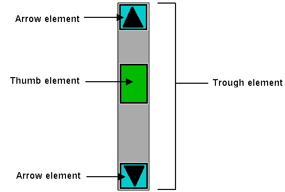
Possible elements of a scrollbar.
Layout
Besides specifying which elements make up a widget, a style also defines how those elements are arranged within the widget. This is called their layout. Our button had a label element inside a spacing element, inside a focus ring element, inside a border element. Its logical layout is this:
border {
    focus {
        spacing {
            label
        }
    }
}
We can ask Tk for the layout of the TButton style:
>>> s.layout('TButton')
[("Button.border", {"children": [("Button.focus", {"children": [("Button.spacing",
{"children": [("Button.label", {"sticky": "nswe"})], "sticky": "nswe"})],
"sticky": "nswe"})], "sticky": "nswe", "border": "1"})]
% ttk::style layout TButton
Button.border -sticky nswe -border 1 -children {Button.focus -sticky nswe
-children {Button.spacing -sticky nswe -children {Button.label -sticky nswe}}}>> Tk::Tile::Style.layout('TButton')
=> [["Button.border", {"children"=>[["Button.focus", {"children"=>[["Button.spacing",
{"children"=>[["Button.label", {"sticky"=>"nswe"}]], "sticky"=>"nswe"}]],
"sticky"=>"nswe"}]], "sticky"=>"nswe", "border"=>"1"}]]Perl> Tkx::ttk__style_layout('TButton')
Button.button -sticky nswe -border 1 -children {Button.padding -sticky nswe
-children {Button.spacing -sticky nswe -children {Button.label -sticky nswe}}}If we clean this up and format it a bit, we get something with this structure:
Button.border -sticky nswe -border 1 -children {
    Button.focus -sticky nswe -children {
        Button.spacing -sticky nswe -children {
            Button.label -sticky nswe
        }
    }
}
This starts to make sense; we have four elements, named Button.border, Button.focus,
Button.spacing, and Button.label. Each has different element options, such
as children, sticky, and border that specify layout or sizes. Without
getting into too much detail at this point, we can clearly see the nested layout based
on the children and sticky attributes.
Styles uses a simplified version of Tk's pack geometry manager to specify element layout.
This is detailed in the style reference manual page.
Element Options
Each of these elements has several different options. For example, a label element has a font and a foreground color. An element representing the thumb of a scrollbar may have one option to set its background color and another to provide the width of a border. These can be customized to adjust how the elements within the overall widget look.
You can determine what options are available for each element? Here's an example of checking what options
are available for the label inside the button (which we know from the layout method
is identified as Button.label):
>>> s.element_options('Button.label')
('compound', 'space', 'text', 'font', 'foreground', 'underline', 'width', 'anchor', 'justify',
'wraplength', 'embossed', 'image', 'stipple', 'background')
% ttk::style element options Button.label
-compound -space -text -font -foreground -underline -width -anchor -justify
-wraplength -embossed -image -stipple -background>> Tk::Tile::Style.element_options("Button.label")
=> ["-compound", "-space", "-text", "-font", "-foreground", "-underline", "-width", "-anchor",
"-justify", "-wraplength", "-embossed", "-image", "-stipple", "-background"Perl> Tkx::ttk__style_element_options("Button.label")
-compound -space -text -font -foreground -underline -width -anchor -justify
-wraplength -embossed -image -stipple -backgroundIn the following sections, we'll look at the not-entirely-straightforward way to work with element options.
Manipulating Styles
In this section, we'll see how to change the style's appearance by modifying style options. You can do this either by modifying an existing style, or more typically, by creating a new style. We saw how to create a simple style that was derived from another one earlier:
s.configure('Emergency.TButton', font='helvetica 24', foreground='red', padding=10)ttk::style configure Emergency.TButton -font "helvetica 24" -foreground red -padding 10Tk::Tile::Style.configure('Emergency.TButton', {"font" => "helvetica 24", "foreground" => "red", "padding" => 10})Tkx::ttk__style_configure("Emergency.TButton", -font => "helvetica 24", -foreground => "red", -padding => 10);Modifying a Style Option
Modifying an option for an existing style is done similarly to modifying any other configuration option, by specifying the style, name of the option, and new value:
s.configure('TButton', font='helvetica 24')ttk::style configure TButton -font "helvetica 24"Tk::Tile::Style.configure('TButton', {"font" => "helvetica 24"})Tkx::ttk__style_configure("TButton", -font => "helvetica 24");You'll learn more about what the valid options are shortly.
If you modify an existing style, like we've done here with TButton, that modification will apply to all widgets using
that style (by default, all buttons). That may well be what you want to do.
To retrieve the current value of an option, use the lookup method:
>>> s.lookup('TButton', 'font')
'helvetica 24'
% ttk::style lookup TButton -font
helvetica 24>> Tk::Tile::Style.lookup('TButton', 'font')
=> "helvetica 24"Perl> Tkx::ttk__style_lookup("TButton", "-font")
helvetica 24State Specific Style Options
Besides the normal configuration options for the style, the widget author may have specified different options to use when the widget is in a particular widget state. For example, when a button is disabled, it may change the button's label to grey.
Remember that the state is composed of one or more state flags (or their negation), as set by the widget's state method
or queried via the instate method.
You can specify state-specific variations for one or more of a style's configuration options with a map. For each configuration option, you can specify a list of widget states, along with the value that option should be assigned when the widget is in that state.
The following example provides for the following variations from a button's normal appearance:
- when the widget is in the disabled state, the background color should be set to
#d9d9d9 - when the widget is in the active state (mouse over it), the background color should be set to
#ececec - when the widget is in the disabled state, the foreground color should be set to
#a3a3a3(this is in addition to the background color change we already noted) - when the widget is in the state where the button is pressed, and the widget is not disabled, the relief should be set to
sunken
s.map('TButton',
    background=[('disabled','#d9d9d9'), ('active','#ececec')],
    foreground=[('disabled','#a3a3a3')],
    relief=[('pressed', '!disabled', 'sunken')])
ttk::style map TButton \
-background [list disabled #d9d9d9 active #ececec] \
-foreground [list disabled #a3a3a3] \
-relief [list {pressed !disabled} sunken]Tk::Tile::Style.map ("TButton",
"background" => ["disabled"=>"#d9d9d9","active=>"#ececec"],
"foreground" => ["disabled"=>"#a3a3a3"],
"relief => ["pressed !disabled"=>"sunken"]);Tkx::ttk__style_map("TButton",
-background => Tkx::list("disabled", "#d9d9d9", "active", "#ececec"),
-foreground => Tkx::list("disabled", "#a3a3a3"),
-relief => Tkx::list("pressed !disabled", "sunken"));Because widget states can contain multiple flags, more than one state may match an option
(e.g., pressed and pressed !disabled will both match if the widget's pressed state flag is set). The list
of states is evaluated in the order you provide in the map command. The first state in the list that matches is used.
Sound Difficult to you?
You now know that styles consist of elements, each with various options, composed together in a layout. You can change options on styles to make all widgets using the style appear differently. Any widgets using that style take on the appearance that the style defines. Themes collect an entire set of related styles, making it easy to change the appearance of your entire user interface.
So what makes styles and themes so difficult in practice? Three things. First:
You can only modify options for a style, not element options (except sometimes).
We talked earlier about identifying the elements used in the style by examining its layout and identifying what options were available for each element. But when we went to make changes to a style, we seemed to be configuring an option for the style without specifying an individual element. What's going on?
Again, using our button example, we had an element Button.label, which, among other things, had a font
configuration option. What happens is that when that Button.label element is drawn, it looks at the
font configuration option set on the style to determine what font to draw itself in.
To understand why, you need to know that when a style includes an element as a piece of it, that element does not maintain any (element-specific) storage. In particular, it does not store any configuration options itself. When it needs to retrieve options, it does so via the containing style, which is passed to the element. Individual elements, therefore, are "flyweight" objects in GoF pattern parlance.
Similarly, any other elements will look up their configuration options from options set on the style. What if two elements use the same configuration option (like a background color)? Because there is only one background configuration option (stored in the style), both elements will use the same background color. You can't have one element use one background color and the other use a different background color.
Except when you can. There are a few nasty, widget-specific things called sublayouts in the current
implementation, which let you sometimes modify just a single element, via configuring an option
like TButton.Label (rather than just TButton, the name of the style).
Some styles also provide additional configuration options that let you specify what element the option affects.
For example, the TCheckbutton style provides a background option for the main
part of the widget and an indicatorbackground option for the box that shows whether it
is checked.
Are the cases where you can do this documented? Is there some way to introspect to determine when you can do this?
The answer to both questions is "sometimes" (believe it or not, this is an improvement; the answer to both used to be a clear "no").
You can sometimes find some of the style's options by calling the style's configure method without
providing any new configuration options. The reference manual pages for each themed widget now generally include
a styling options section that lists options that may be available to change.
This is one area of the themed widget API that continues to evolve over time.
The second difficulty is also related to modifying style options:
Available options don't necessarily have an effect, and it's not an error to modify a bogus option.
You'll sometimes try to change an option that is supposed to exist according to element options, but it
will have no effect. For example, you can't modify the background color of a button in the aqua theme
used by macOS. While there are valid reasons for these cases, it's not easy to discover
them, which can make experimenting frustrating at times.
Perhaps more frustrating when you're experimenting is that specifying an incorrect style name or option
name does not generate an error. When doing a configure or lookup you can provide an entirely arbitrary name for a style or an option. So if you're bored with the background
and font options, feel free to configure a dowhatimean option. It may not do anything, but it's not
an error. Again, it may make it hard to know what you should be modifying and what you shouldn't.
This is one of the downsides of having a very lightweight and dynamic system. You can create new styles by providing their name when configuring style options without explicitly creating a style object. At the same time, this does open itself to errors. It's also not possible to find out what styles currently exist or are used. And remember that style options are really just a front end for element options, and the elements in a style can change at any time. It's not obvious that options should be restricted to those referred to by current elements alone, which may themselves not all be introspectable.
Finally, here is the last thing that makes styles and themes so difficult:
The elements available, the names of those elements, which options are available or affect each of those elements, and which are used for a particular widget can be different in every theme.
So? Remember, the default theme for each platform (Windows, macOS, and Linux) is different (which is a good thing). Some implications of this:
- If you want to define a new type of widget (or a variation of an existing widget) for your application, you'll need to do it separately and differently for each theme your application uses (i.e., at least three for a cross-platform application).
- As the elements and options available may differ for each theme/platform, you may need a quite different customization approach for each theme/platform.
- The elements, names, and element options available with each theme are not typically documented (outside of reading
the theme definition files themselves) but are generally identified via theme introspection (which we'll see soon).
Because all themes aren't available on all platforms (e.g.,
aquais only available on macOS), you'll need ready access to every platform and theme you need to run on.
Consider trying to customize a button. You know it uses the TButton style. But that style is implemented using a different
theme on each platform. If you examine the layout of that style in each theme, you'll discover each uses different elements arranged
differently. If you try to find the advertised options available for each element, you see those are different too.
And of course, even if an option is nominally available, it may not have an effect).
The bottom line is that in classic Tk, where you could modify any of a large set of attributes for an individual widget, you'd be able to do something on one platform, and it would sorta-kinda work (but probably need tweaking) on others. In themed Tk, the easy option just isn't there, and you're pretty much forced to do it the right way if you want your application to work with multiple themes/platforms. It's more work upfront.
Advanced: More on Elements
While that's about as far as we're going to go on styles and themes in this tutorial, for curious users and those who want to delve further into creating new themes, we can provide a few more interesting tidbits about elements.
Because elements are the building blocks of styles and themes, it begs the question of "where do elements come from?" Practically speaking, we can say that elements are normally created in C code and conform to a particular API that the theming engine understands.
At the very lowest level, elements come from something called an element factory. At present, there is a
default one, which most themes use, and uses Tk drawing routines to create elements. A second allows you to create
elements from images and is accessible at the script level using the ttk::style element create
method (from Tcl). Any image format supported by Tk is available, including scalable image formats like SVG, if you have
the right extension. Finally, there is a third, Windows-specific engine using the underlying "Visual Styles" platform API.
If a theme uses elements created via a platform's native widgets, the calls to use those native widgets will normally appear within that theme's element specification code. Of course, themes whose elements depend on native widgets or API calls can only run on the platforms that support them.
Themes will then take a set of elements and use those to assemble the styles that are actually used by the widgets. And given the whole idea of themes is that several styles can share the same appearance, it's not surprising that different styles share the same elements.
So while the TButton style
includes a Button.padding element, and the TEntry style includes an Entry.padding element, underneath, these
padding elements are more than likely one and the same. They may appear differently, but that's because of different
configuration options, which, as we recall, are stored in the style that uses the element.
It's also probably not surprising to find out that a theme can provide a set of common options that are used as defaults
for each style if the style doesn't specify them otherwise. This means that if pretty much everything in an entire theme has
a green background, the theme doesn't need to explicitly say this for each style. This uses a root style named ".".
If Fun.TButton can inherit from TButton, why can't TButton inherit from "."?
Finally, it's worth having a look at how existing themes are defined, both at the C code level in Tk's
C library and via the Tk scripts found in Tk's "library/ttk" directory or in third-party themes.
Search for Ttk_RegisterElementSpec in Tk's C library to see how elements are specified.
Spotted a mistake? Couldn't find what you were looking for? Suggestions? Let me know!
If you've found this tutorial useful, please check out Modern Tkinter.